
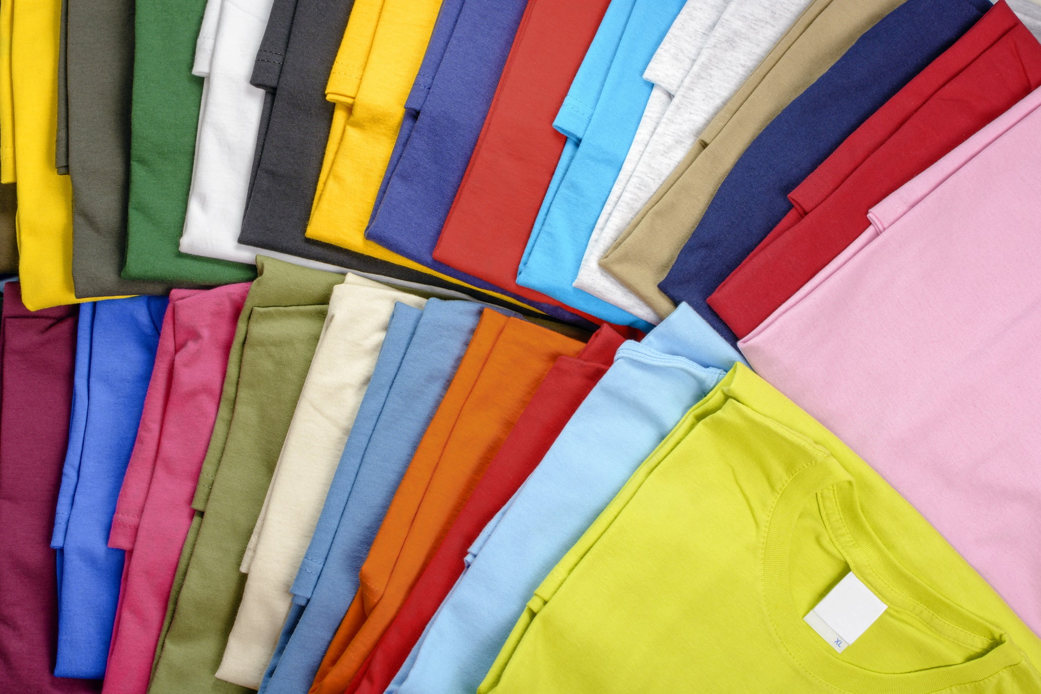
It used to be your pride and joy, your new website … and then, not long ago, it started looking a bit lost … almost like a tee shirt.
So What Went Wrong?
It’s no one’s fault. The world moves on. If your website was designed a few years ago, there’s a good chance that both you and your web designer are using a much bigger monitor now. The internet changes all the time – and so does your office.
The balance of wide images (typically the masthead image) and text has changed. Full width images now fit your gorgeous new 4K studio display beautifully. But your original document width has remained the same. This means large areas of white space have crept into sections of your website distorting the design.
But Isn’t White Space Good?
We’re designers. We love white space. But there’s a time and a place. Design is about balancing elements on the page so that the layout is easy for your eye to read and everything looks harmonious. Arbitrarily changing the relationships of items on the page disrupts and, in some cases, destroys the page.
So can I not Just Make the Document Width Wider?
Tricky
You’re not wrong. And let’s not forget that now that most people aren’t even looking at your website on a monitor. They’re looking on it on their b****y phone, on the bus, the train. Bigger screens, smaller screens … the whole thing’s got very complicated.
Expectations have changed too. With the adoption of touch screen devices and the ease of scrolling with a ‘swipe’, older concepts of ‘above the fold’ design don’t hold the sway they used to.
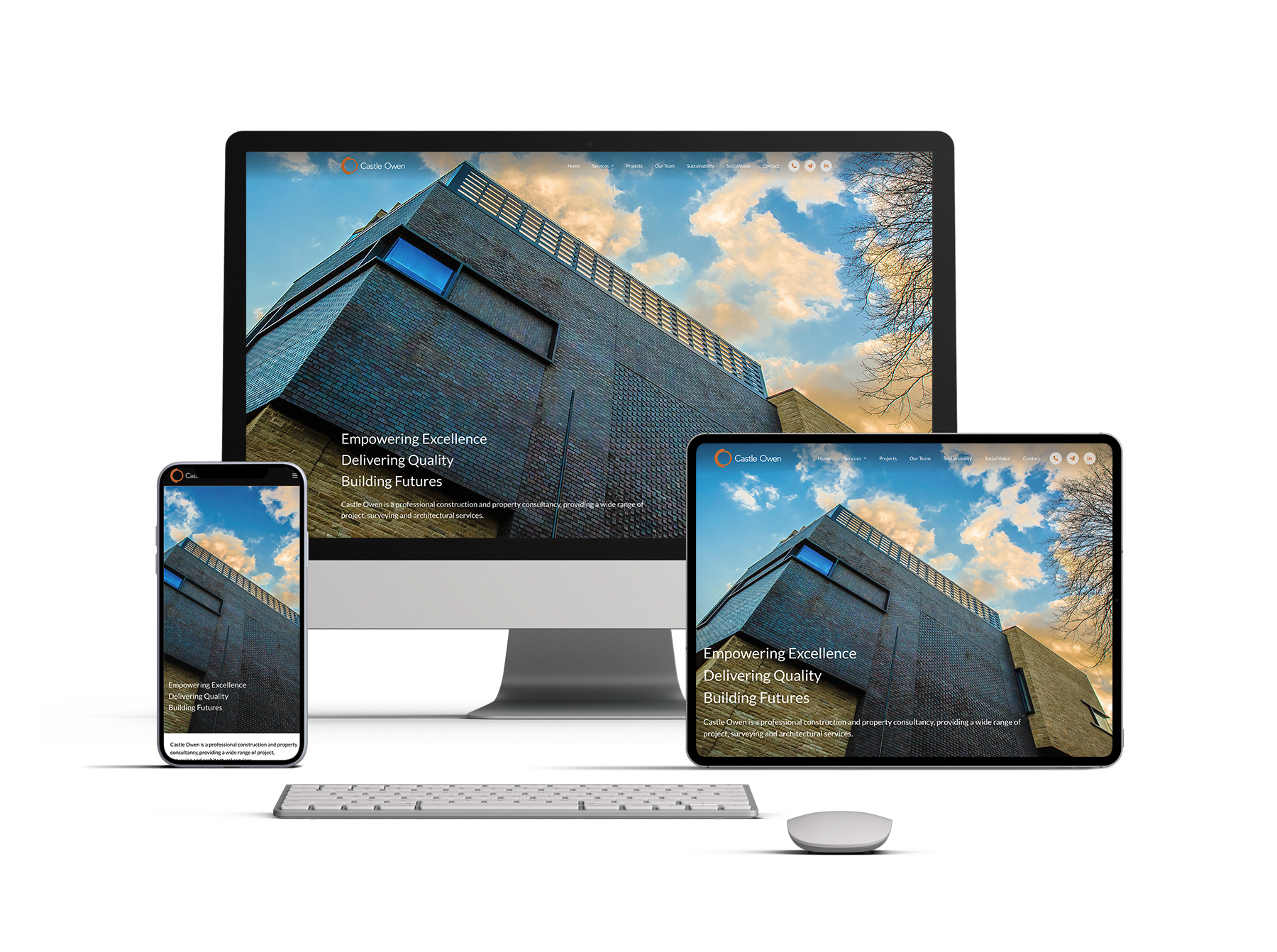
Nice site – but not much going on above the fold … https://castleowen.com
So What Can We Do?
Well, your website probably needs a refresh. Modern CSS frameworks allow images to place objects next to each other if space allows or drop them into a column on a smaller device. A smaller device may mean a 17″ monitor … it takes skill to work these things out.
If your website is on a pretty standard framework, it oughtn‘t cost the earth.
Let Little Fire Fix Things Up
It is hard; it takes talent and experience … which we have by the bucket load. We also have specialist tools which allow us to look at a dizzying range of touch-screen devices. We test every site extensively (our pre-launch check list is over 75 tests long) and we can test specifically for appearance on almost any handset you can mention.
Also … don’t leave it so long next time. The internet is changing all the time and ever faster. Your website will benefit from a regular review. Regular maintenance and/or SEO will spot these changes as they emerge and we’ll work with you to keep your site looking pin sharp.
Need a Website Makeover?
Talk is free. Find out how we can keep you looking dapper online.