

Does your website have trust issues? Website design mistakes can damage trust online.
Table of Contents
While You’re Sleeping
If you want your clients to treat you as a professional, you must present yourself as a professional. You may be a superb lawyer, an expert plumber or an outstanding coach. But if your website is off, it’s going to do harm to your reputation. In your absence, your website is all that most potential clients will see.
Bless your website – it tries to work for you 24/7. It may be propounding your knowledge, expertise and track record even as you sleep. But if your visual design is poor (or poorly executed), it might as well be wearing clown shoes.
Just as it can be working for you while you’re sleeping, get your site wrong and it could be harming your efforts 24/7/365,
It’s a kind of friction. Like theatre lighting, most people will only notice if it is wrong. If your site wears away at your users’ enthusiasm, they will drift off before clicking that button, completing that form or buying that widget.
According to Google, only about 20% of users will ever return to a site if their first visit results in a bounce. That’s 80% of your potential customers lost. Immediately. Forever.
Not everything is in your direct control. Site speed is primarily the domain of your developers and hosts. SEO takes time and is all about getting users to your site, and not what they do there. But the site itself, the visual design, is entirely within your gift. Get it pin-sharp. There is no excuse for these elementary website design mistakes.
1. Your Logo
There it is. At the top of the web page. According to almost all research and heat mapping, your logo is where the user’s eye first alights. Regardless of the reading pattern … that little slice of screen real estate is the one part of your website that almost every user will see.
So get it right.
Do not be tempted to scrimp on disk space. Most logos are simple. Do not use a JPEG. Do not, not, not, not copy and paste it from a Word document. Not ever.
If you’ve read this far (well done and thank you), I hope you can appreciate just how poor the above looks.
Modern image formats allow you to save images using far less disk space than ever before. An efficient cacheing policy will mean your users only need to download them once. Don’t worry about the size of your logo overly – of all the images on your site, this is the one where being crisp and perfect really matters. In fact, with retina displays, your logo is one location where you might choose to use an over-sized image.
If possible, use an SVG file. SVG files will always display at the highest possible resolution for any given device.
Make it the most up-to-date logo you have; if the logo on your business card, social media and website do not match, that dissonance will damage user trust and sow doubt in your users’ minds that they are in the right place.
Doubtful users leave. Confused users leave.
If you paid a designer to create your logo, honour their intentions. If they specified a given amount of space to be given over to your logo, allocate that space.
Your designer is someone you paid to make things look good – ignoring their specifications is literally throwing money away – and undermining trust in your online presence.
Don’t let a website design mistake be the first thing your visitors see.
2 Colour
On a standard RGB display, there are 16,777,216 possible colours available. Pick the right one.
Coca-Cola, Harrods, Hertz… these huge businesses understand the importance of getting colour just right.
You should too.
To a design professional, incorrect colour usage sticks out like a sore thumb. To a normal user, just as with the logo, if it’s not right, your site just looks unprofessional. It undermines trust.
There are difficulties here, not every monitor is the same: if a monitor is old and dim, poorly calibrated (or not calibrated at all), comparisons between a colour specification and the screen may be wide. But the eye adapts. In the same way that, after a few minutes in sunglasses, all the colours look natural – correctly coded, a website will still look ‘right’ even on an old monitor.
Someone else’s hardware is not an excuse for your website design mistakes.
Colour matters; we’ve seen clients refuse to pay for printed matter because the colours weren’t spot on. You should accept nothing less for your website.
Again, if you’ve paid a designer to create an identity for you, it is more than likely that they have specified colours for you to use. These will either match or harmonise with your logo. Most modern website page builders and themes will let you match those colours exactly – use those guidelines.
Occasionally, a plugin or a website embedded app will not allow you to match your colours exactly, but a skilled developer ought, in most cases, be able to apply additional CSS to bring these elements inline.
3. Typeface

… websites were all in Times New Roman, heavily pixelated with bright blue links? If the internet had not been a novelty then, I doubt we would have read a thing. Even then, it felt like a website design mistake.
Geek alert: at Little Fire Digital, we love type, we obsess over it. Why? Because it matters, a picture speaks a thousand words … but so do a thousand words. And, if those thousand words can be displayed in a legible, elegant manner, so (very) much the better.
There are so many website design mistakes with typography:
Poor choice of Typeface
If you’re a lawyer or another professional, don’t do this:

or this:

or this:

If you do, you might as well meet your client in Speedos. If you’re hiring beach buggies, fine, if you’re settling matters of family law, you might want something rather more sober.
By the same token:

Will not have your beach bar buzzing.
Website type is not what is was. Modern @font-face directives mean website type can be anything you like. Google Fonts offer a huge array of typefaces you can use.
Better yet, Adobe and other professional type libraries will often let you match your long-suffering designer’s specifications.
Your choice of website typeface must, at worst, be appropriate … if at all possible, it should be perfect.
Poor Typography
The point of writing is to convey meaning and, normally, it requires users to read it all to succeed. There is a reason why books are designed the way they are. They are a design classic – they ask a lot of the user (hours of concentration), so in return offer an easy typeface to read, in a legible format (black text on a white page) at a suitable size. We defy you to find a novel (not an article, a leaflet or a brochure) designed otherwise.
Screens are different – sans-serif typefaces work better and users are more tolerant of reversed text (white text, dark background), but many conventions are the same.
Don’t do this:
Or this:
Are you squinting yet?
Or even this:
REVERSED, CAPITALISED TEXT IS VERY HARD TO READ … THIS IS JUST A FEW WORDS.
IMAGINE AN ESSAY
Typography is a big subject, but at its heart, the biggest website design mistake is making your customers work hard. Great typography requires talent, taste and training – making your website comfortably legible is within the gift of most web designers.
4. Responsive Design
There are lots of devices out there and so many screen sizes. Even a single table has two effective displays (landscape and portrait). A casual visitor to your site will not experiment – your website will either look like you designed it for them or it will look naff.
Mobile-friendly just isn’t enough. What you genuinely need is fully responsive design. If your site looks “meh” on your users’ device, your website is, to them, rubbish – and, by inference, you are too. Users don’t know that it looks perfect on an iPhone 12 Pro Max – it just looks wrong.
If your website isn’t fully responsive, what happens? On a phone, users will constantly pinch and zoom, accidentally click tiny links, or scroll endlessly to view content. On a large monitor, layouts might appear stretched or awkwardly sparse.
This isn’t just inconvenient; it’s a direct barrier to engagement. It actively frustrates your visitors, forcing them to work harder.
If your visitors were aware that your site looks great on other people’s devices, it would just look like you don’t care about them. However, most of the time, it just appears that your website is rubbish. Trust in your professionalism, your ability to deliver is left, like a stranded child, on the shore.
5. SSL Certificate: Announce Your Untrustworthiness
Okay, you got us. This isn’t “visual design” in any sense. But, without an up-to-date SSL Certificate, your clients’ browsers will literally tell them not to trust your site.
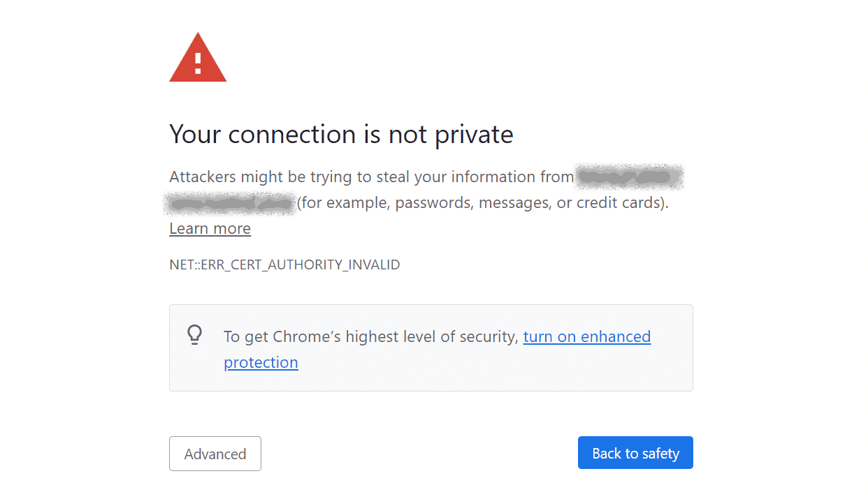
An SSL (Secure Sockets Layer) certificate encrypts the connection between a user’s browser and your website. It’s responsible for the “https://” prefix in your URL, and crucially, enables that reassuring padlock icon in the address bar.
If your site lacks an SSL certificate or if it’s expired, modern browsers will display stark warning messages. These can range from a “Not Secure” notice to a full-screen interstitial page declaring: “Attackers might be trying to steal your data”.
The browser doesn’t even offer you the option to proceed to your website by default (if at all): only a determined user with internet smarts is going to make it to your site at all.
Most sane potential customers would have fled long ago.
Go straight to jail, do not pass Go, do not collect £200.
Your website has failed.
Trust is Earned, Not Given
Done right, your website works tirelessly for your business. But just as easily as it can attract and convert, it can also repel if plagued by these common design mistakes.
Professionalism in the digital age isn’t simply about having a website; it’s about having a well-designed, well-maintained, and user-centric one. Every pixel, every line of code, every design decision contributes to the overarching impression you make.
If you want a team that will nail these five (and many others), a team who will implement brand-consistent colours, a pin-sharp logo, precise typography, fully responsive layouts, and an essential SSL certificate, you want Little Fire Digital.
Getting these things right makes a profound statement: that you are meticulous, competent, relevant and, most importantly, trustworthy.
Build a digital presence that not only looks good but actively inspires confidence and professionalism. Build it with us.