

“What am I doing on Facebook?” I asked myself. I was meant to be reviewing the Retraining Pain website … yet, despite a clear financial incentive, I had drifted away and was now fidgeting away on a neighbouring tab.
I’d love to say it’s the first time.
I’m distractible, sure, but in a world where most website visits last less than ten seconds, I’m also typical. Reviewing websites is a key part of our business; yet with this site and many others, we found it genuinely difficult to stay engaged – even when doing so offers clear monetary opportunities.
And we’re geeks.
If incentivised, tech-savvy professionals slip away, we don’t fancy your chances with Joanna Public.
Website owners will live with a site for a long time when they know it’s not quite what it needs to be. They know what the website is meant to do and all the workarounds to make it do so. They may acknowledge limitations and bugs, yet the incentive to retain the status quo remains strong. Sometimes it almost feels like Stockholm Syndrome.
But first-time visitors aren’t aware of bugs and won’t know where to look for hard-to-find resources. There is a cognitive gap between the practised owner and a naïve visitor – sometimes it takes fresh eyes to see it.
So we wrote down all of our thoughts and put them into a proposal and presented it with some trepidation.
Fortunately, like the gents they are, the team at Retraining Pain took our advice on the chin and accepted all our recommendations … and this is that story.
Table of Contents
About Retraining Pain
Based in Huddersfield, the duo at Retraining Pain coordinate interdisciplinary teams across the country. Beyond pain management, they believe much chronic pain can be genuinely cured – or at worst lessened. From Exeter to Edinburgh, they help clients across the country regain control of their lives and alleviate real suffering.
Unlike traditional single-discipline clinics, Retraining Pain brings together physiotherapy, psychology and medical expertise to treat the whole person – the Biopsychosocial Approach (for want of a bigger mouthful). This holistic but specialist practice removes much of the stress of travel and the frustration of waiting lists in the local area, bringing expert care directly to the client’s home.
Quite simply, if alleviating suffering isn’t something Little Fire wants to get behind, we’re not the people we believe we are. Communicating this sophisticated “team around the patient” model through a website is a complex challenge, one we were committed to meeting.
About the Project
Retraining Pain is a successful business; they have earned an excellent reputation working with case management professionals who refer those living with pain.
They have developed self-managed courses for end users to help manage their own symptoms. Having experimented with a couple of platforms, they have settled on Kajabi.
Retraining Pain offer a schedule of events, both free and paid, for case workers and allied professionals, as well as free online events for people in pain.
The team also have a developing business in the workplace, advising companies and HR departments how best to help with a workforce in a humane way and reduce acute injury, chronic injury (RSI), absenteeism and presenteeism.
Retraining Pain have a professionally drawn up logo and corporate ID. Their legal pages are in excellent order. The website contained some excellent content and an active blog – we did not want to throw out the baby with the bathwater.
As with business, so too with websites. Change is a constant: whatever we developed would need to accommodate business developments in the near future.
So What We Did
Bridging the Cognitive Gap
Top of the pile, this was a site that needed some clarity to meet the challenges ahead. The online world is noisy and distracting – you need to keep your signposting as simple as possible.
If your visitors cannot see where they are meant to go, they are unlikely to go there
This matters: if you’re not directly talking to your desired users they are very unlikely to stop and listen. If they’re not listening, they’ll wander off somewhere else (Facebook, for example).
So we rebuilt the sitemap with a section for each of their desired customer groups: people living with pain, case managers and professionals living with pain and workplace managers. Once done, it’s simple to expand – adding more content to the professionals section will cause no loss of clarity in the rest of the site.
We built on the good bits. The users familiar with the site can find the usual links (like ‘Make a Referral’) right there, at the top of the page, but it’s easier to navigate for first-timers.
It’s All About the Semantics
The site had been built before the days of the WordPress Gutenberg editor and, as anyone will tell you, the classic WordPress editor is rubbish. It is far harder to build a page with visual and semantic hierarchy because it’s far harder to see as you edit. Just by replacing the editors, we could instantly build attractive pages which make clear visual sense to the reader.
This matters. Accessibility is an increasingly important metric when assessing website quality. Indeed, website owners have a clear legal obligation to make their sites accessible.
No-One Likes a Pop-Up
So we’ve used modern software to build quieter, subtler pop-ups which the user can dismiss indefinitely if they choose. The factsheets and assets offered as part of the lead capture are now emailed to the user on completion of a short form – a clear, transparent exchange and a system easy to maintain at a later date.
Using Zapier, we integrated the forms with the client’s new mailing lists on Kajabi.
Resetting the Tone
Retraining Pain had built a business working with professionals but increasingly are seeking to help people living with pain directly.
Retraining Pain understand that chronic or long-term pain is a difficult, lonely thing. Yet the limitations of the site precluded any display of empathy. Having created a section specifically for those working on recovery, we took time to consider the ‘tone’ of the content and between us came up with:
- Language suited to a potentially vulnerable individual. We worked with the team to refine the tone. For example, replacing the word ‘course’ (homework, assessment, potential failure) with the word ‘programme’ (a process, something you can complete).
- A focus on good ‘netiquette’ – pain is stressful, not everyone is tech-savvy, so we focused on a consistent experience throughout the site and simple customer flows. Signing up to a programme requires a change of platform (to Kajabi) so, at the point where that jump needs to be made, we clearly signposted the fact.
- The site already offers a range of free resources to help people manage their pain, so we set up a new datatype to turn that into a new library of resources. This is easy to browse, easy to manage (we significantly expanded it before launch) and when the time comes, we can rapidly deploy resource libraries for the site’s other user groups.
Hey, Good Looking
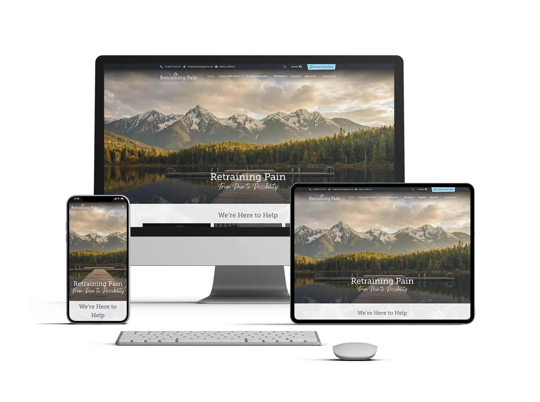
Seven years is a long time online. The past may be a different country: on the internet, it‘s a different world.
Images had been sourced a long time ago, including some from commercial image libraries. In the intervening years, networks have got faster, screens bigger and image formats have evolved. What would have been normal, if aggressive, image compression seven years ago, looks poor on a modern monitor.

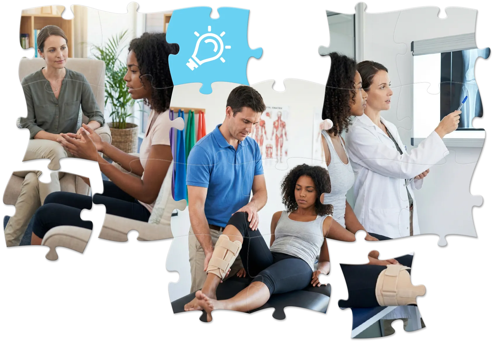
Also, we had very few photos of people: and people relate to photos of people. Healthcare is a tricky area for photography, patient confidentiality and model release are not easy bedfellows – and most commercial library images are just. plain. naff.
So what did we do?
- We replaced all the images – we raided commercial image libraries for suitable images where we could – we took care to keep some continuity: the clients had these chosen images originally. For example, Win Hill in Derbyshire makes a welcome return.
- Where images couldn’t be reused, we had AI cook up replacements. This neatly sidesteps issues of patient confidentiality – we’re often rude about AI but, in this case, nice work Gemini.
- The phrase ‘puzzle of pain’ appears several times in the copy – so we took the metaphor and ran with it. The fit was perfect, and so we whipped out our silky Photoshop/Illustrator skills to build the team something unique
Not Just a Pretty Face
The clients have a standing corporate identity which uses Museo Slab font. By licensing the typeface from Adobe, we made titles and subtitles link closely with the logo, lending coherence to the site as a whole. They have also recently adopted an attractive script font, we purchased a license for this too.
Both typefaces are neatly embedded in the stylesheets so that using them correctly is as simple as applying a header.
Warming Things Up
Like many health-related businesses, Retraining Pain had chosen a colour scheme based on white, black and a health-adjacent blue.
Nothing wrong with that, but for a site like this, we needed more warm colours to appeal to people outside the profession.
So, without abandoning those original scheme, we built out a full palette of complementary organic colours to give the site a relatable, more human tone.

… and then for a bit of eye candy, created a plugin to add a subtle custom animation to the pages.
In Short
Retraining Pain now have a fully accountable set of assets, clearly within copyright and a larger, more flexible corporate ID.
E-Commerce
The E-Commerce had got in a tangle.
But it turned out the solution was right at hand. Once we’d worked out what the client needed, it fell into place. Kajabi already handles client payments on Stripe, and the team was looking to simplify their payments throughout.
WordPress has some terrific event ticketing plugins, we hooked them up to WooCommerce and we not only made their online payments sane but made their forthcoming events section engaging and good-looking.
As with other areas of the site, this is highly maintainable. When events for, say, workplace managers are launched, we can quickly roll out a page with those events pre-selected.
Of course, WordPress is fiddly and event handling in WordPress even fiddlier, so we’ve set up a Google Drive for the client with training videos in – we’ll add more to help the client.
So What Did Little Fire Really Do?
About the Tasks The scope of work was comprehensive. We were hired to design a website; we believe we’ve fixed the business logic behind it. The tasks included:
- Strategic Audit: Identifying the “cognitive gap” between the client’s perception and the user reality.
- UX/UI Overhaul: Expanding the visual identity and navigating strict healthcare compliance and copyright issues.
- Technical Re-architecture: Moving from a fragile legacy build to a robust, scalable WordPress environment.
- Process Automation: Integrating financial and marketing systems (Stripe, Kajabi, Zapier) to minimise manual administration.
- Content Strategy: Modify the site’s voice to be empathetic yet authoritative.
… and wrapped it up in one great-looking bundle.
And What Did the Client Say?
Well, we get good testimonials but they are seldom this good:
“Simon at Little Fire was recommended to us for a website refresh from our original, rather basic website that we used to set up 7 years ago. He was incredibly thorough in reviewing our old site, proposing what we needed, working to our budget and getting on with the job. I was pleasantly surprised how quickly the new site came together! Simon was a pleasure to work with, clearly really knows his stuff, a great eye for detail, and has been brilliant at communicating with us and keeping us updated. Thank you Simon for your patience, generosity with your time, and your vision for our new site. You seem to truly care about what you do and it is reflected in your work. Highly recommend.”
Romy Sherlock, Retraining Pain
Cheers guys, this was a privilege.
Conclusion
In digital projects, there is often a fear that fixing the underlying structure – the “boring bits” like payment gateways, font licensing and semantic markup – will kill the momentum. But we are Little Fire Digital and we love this stuff – like fixing a clock, the opportunity to be creative is everywhere.
By addressing the technical debt and the “cognitive gap” head-on, we didn’t just give Retraining Pain a visual refresh; we built them a business tool that can actually work. We took a site that confused new visitors and turned it into a platform that welcomes them, guides them and supports them from pain to possibility.
And we did it all in eight weeks, over Christmas.
We’re proud of this one, please check it out.
Need your website to talk to your customers?
Of course you do … drop us a line.